- The Breakdown
- Posts
- 🟪 Friday charts


Friday charts: Illuminating progress
In 1906, Upton Sinclair went undercover in Chicago's meatpacking plants to expose the brutal realities of poverty in The Jungle: families living in overcrowded squalor, children working in hazardous, dehumanizing factories, workers maimed and discarded by industrial capitalism with no safety net whatsoever.
In 2025, we have a new kind of data-driven muckraker: Michael W. Green, an asset manager, whose brave discovery that American families making less than $140,000 are living in poverty has gone viral.
One can only marvel at how these families survive on such meager six-digit incomes! By Green’s logic, two-thirds of Americans should be eligible for food stamps.
Unlike Sinclair, however, Green doesn't appear to have spent any time with the families he's championing. If he had, he might have sensed that his spreadsheet was leading him astray.
Economists who are more adept at interpreting data are seemingly unanimous in their assessment of Green’s viral thesis.
Scott Winship calls it “the worst poverty analysis I have ever seen.”
Tyler Cowen finds that Green’s study is “all wrong. The underlying concepts are wrong, the details are wrong, and the use of evidence is misguided.”
Jeremy Horpedahl says “it’s ridiculous to use $140,000 as a poverty measure.”
Noah Smith says Green “gets his own numbers completely wrong” and that his conclusions are “very silly.”
Green responds to some of these critiques here, but you probably don’t need to be a credentialed economist to sense the critics are right — because surely no one making $139,000 a year is going hungry?
Green’s argumentation is admittedly more nuanced than that.
He cites, for example, MIT’s “cost of thriving” index which estimates that it took 30 weeks of the median male’s earnings to live a good life in 1985 vs. 63 weeks now.
I’m not an economist, and I would not have even made the waitlist at MIT. But, having been alive in 1985, I can authoritatively say that things are now both easier and better than they were back then — economically, at least.
Television shows, movies, music, fashion and celebrities were all far better in the 1980s, of course. Not to mention the blissful lack of both cellphones and adult supervision.
But cars, appliances, power tools, video games, beer? Virtually anything you can buy to make your life better is better today than it was then.
In nearly all cases it’s cheaper too, when adjusted for quality.
Even housing.
“Green notes that housing costs have risen,” Cowen writes, “but Americans today have more living space on average than ever before, and live alongside fewer people.”
And healthcare!
Cowen explains that “the overall trend in healthcare has been deflationary, rather than inflationary — or, in economics speak, that the cost of buying an extra expected year of life has been going down rather than up.”
More intuitively, Cowen says simply, “I would rather have current healthcare at current prices than 1972 healthcare at 1972 prices.”
Me, too: I’d rather have current anything at current prices than 1985 anything at 1985 prices.
This intuition — that the statistics Green is looking at miss massive improvements in what our dollars actually buy us — is more than just anti-nostalgia, if that’s a word. (Presentism? Currentism?)
William Nordhaus famously demonstrated this systematically by measuring the cost of lighting in lumens. By tracking lumen-hour costs across technologies like candles, kerosene and electric bulbs, Nordhaus showed how ignoring quality change (more light per unit input, in the case of lighting) massively underestimates historical assessments of economic growth.
The cost of lighting a room for three hours — which took about three hours of work to afford in 1800 — requires just a fraction of a second of labor now: a roughly 43,000-fold improvement that official statistics missed almost entirely.
With this, Nordhaus demonstrated the larger point that because technological change is not fully reflected in GDP statistics, we tend to underappreciate how much our standard of living has improved.
The flip side is that failing to account for these changes can lead to some absurd conclusions about the cost of living, as expressed in this classic tweet:
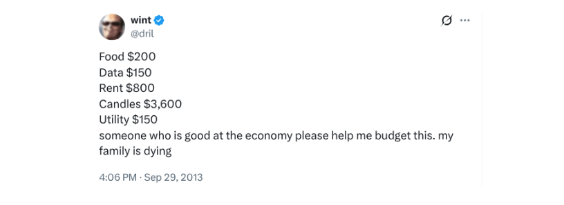
The joke is that someone stuck buying 1800s lighting technology at 1800s costs would indeed be impoverished because they wouldn’t have anything left over to spend on modern healthcare, housing or smartphones.
Green seems to make the same statistical mistake: He looks at modern families spending on vastly superior goods and services without accounting for the vastly superior value they’re getting.
“There is a major conceptual error in Green’s focus on high prices,” Cowen concludes. “Prices are high in large part because demand is high, which can only happen because so many more Americans can afford to buy things.”
$140,000 a year buys a lot of things.
Let’s check the charts.
Moving on up:

The US middle class has been shrinking, but only because the upper class has been expanding. In 1967, 5.2% of US families earned over $150,000 (inflation adjusted) vs. nearly 34% now.
People have been moving up into the middle class, too:

The percentage of Americans with income more than 200% of the federal poverty line (c. $60,000 for a family of four) has risen by 8.5 percentage points since 1975.
Poverty, however measured, is trending down:
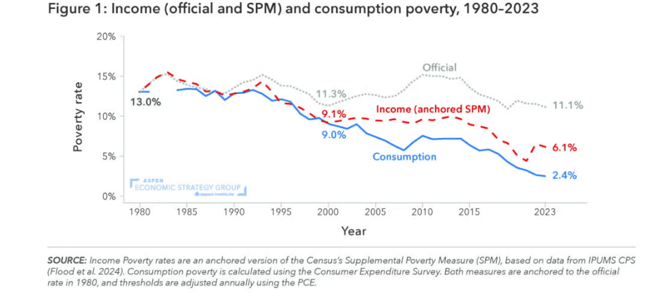
This chart from the Economic Strategy Group shows that poverty has fallen by roughly half according to income-based measures and by more than 80% using consumption-based measures — in both cases, more than government statistics indicate.
Consumption is up:
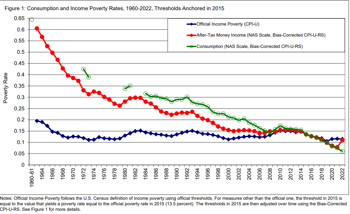
An academic study of "consumption poverty" (in green) and "after-tax poverty" (in red) shows that the official, CPI-based measure of poverty fails to capture decades of improvement.
More food:
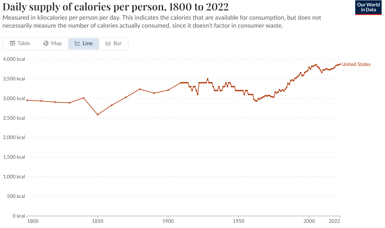
Americans consume about 3,800 calories a day — 15% more than we did in 1985 and roughly 50% more than we’re supposed to.
More healthcare:

8.2% of Americans were uninsured in 2024, down from 16% in 2010.
Candles were once a luxury good:
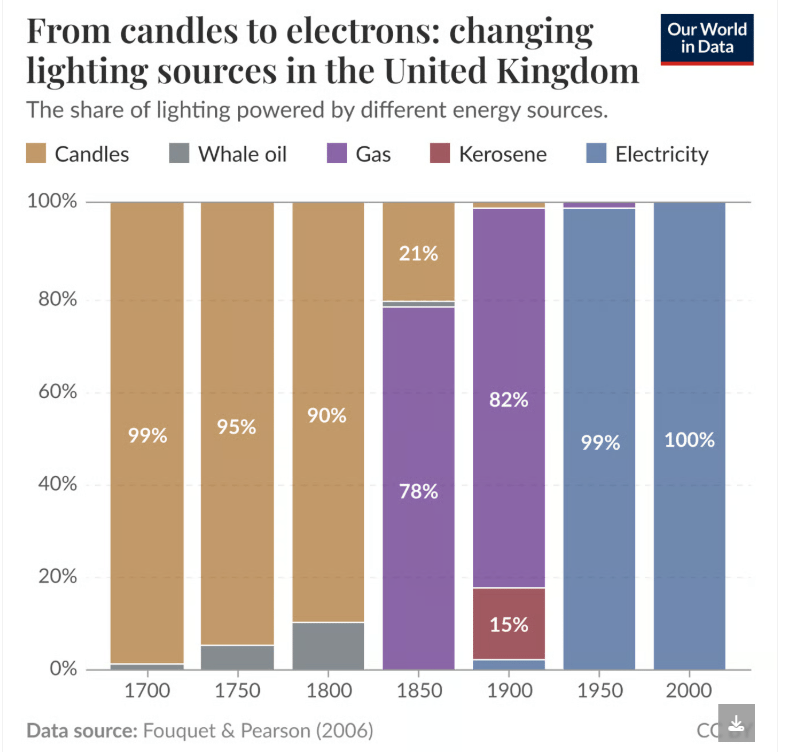
This is a reminder that as recently as 1800, candles were so expensive that it was economic for people to venture out into the oceans and risk their lives hunting whales.
Illuminating:
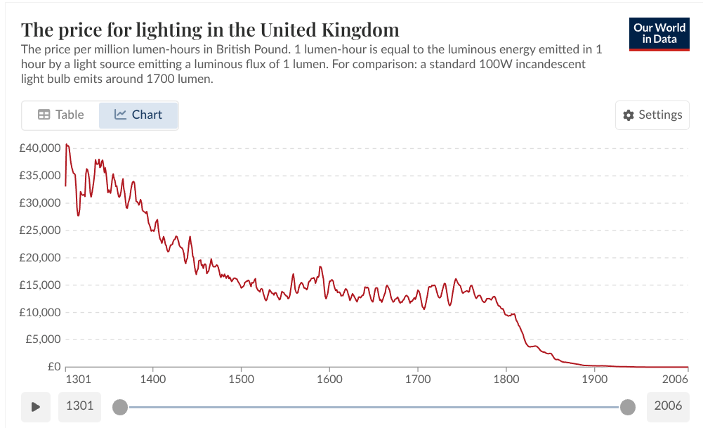
A million lumen-hours is roughly the amount of light you’d get from an ordinary household light bulb running continuously for about two months. In the year 1300, that would have cost the equivalent of $52,000. Yikes.
In Nordhaus terms:

William Nordhaus made economic progress more tangible by calculating the “time-price” of light. In 1830, you had to work three hours to afford a single hour of candlelight. Today, you earn that same hour of light in one-thirteenth of a second.
Have a great weekend, upper class readers.

Brought to you by:
Institutions and DeFi are converging on Canton, creating real-world finance with crypto-style speed.
The latest The Tie report shows growing demand for privacy, composability, and sustainable tokenomics.
With 575+ validators and 600K+ daily transactions driving on-chain activity, Canton’s network momentum is accelerating on-chain global finance.

Brought to you by:

Add onchain trading to your product without the hassle.
The Uniswap Trading API offers plug-and-play access to deep liquidity — powered by the same protocol that’s processed $3.3T+ in volume with zero hacks.
Get enterprise-grade execution across onchain and off-chain sources for optimal pricing. No complex integrations or crypto expertise — just seamless, scalable access to trusted DeFi infrastructure.
More liquidity. Less complexity.